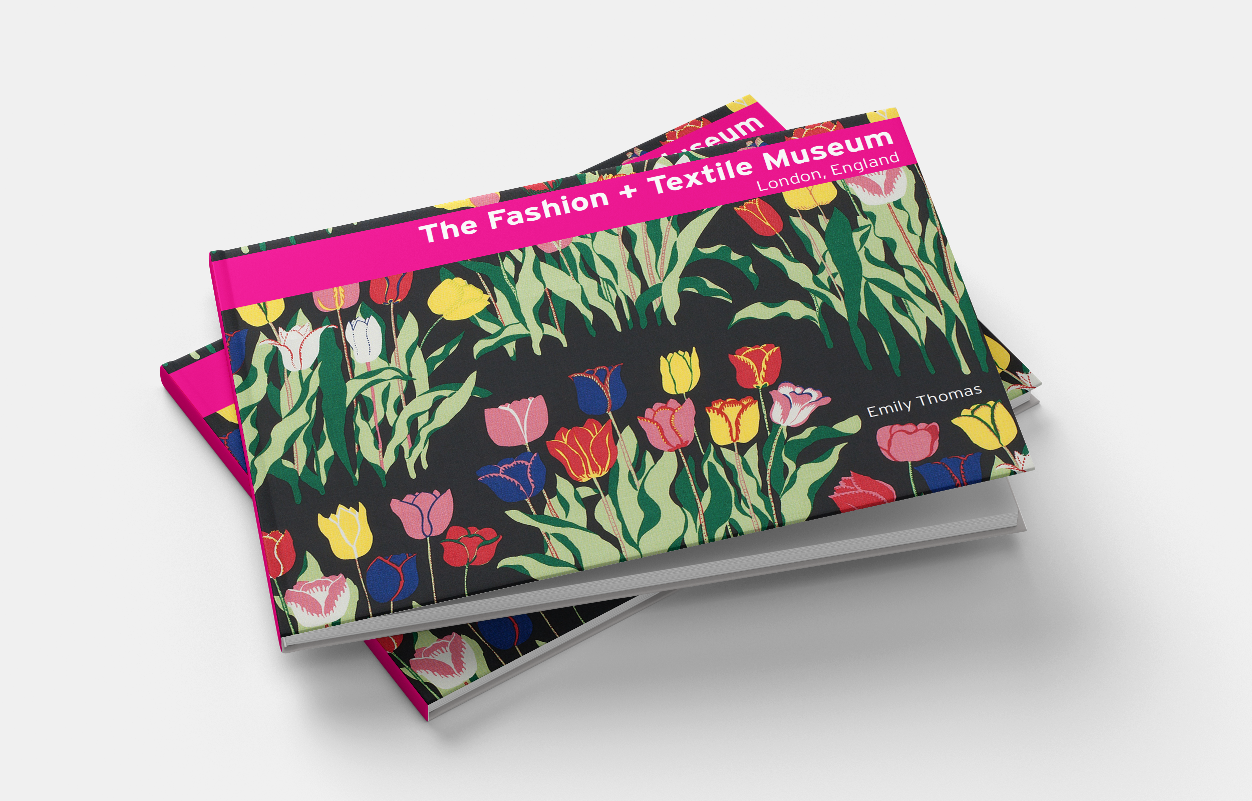
For this complete rebrand of the Fashion and Textile Museum in London, I utilized element such as color, pattern, play, texture, and typography to reflect on the true nature of this unique and sophisticated museum (concept)

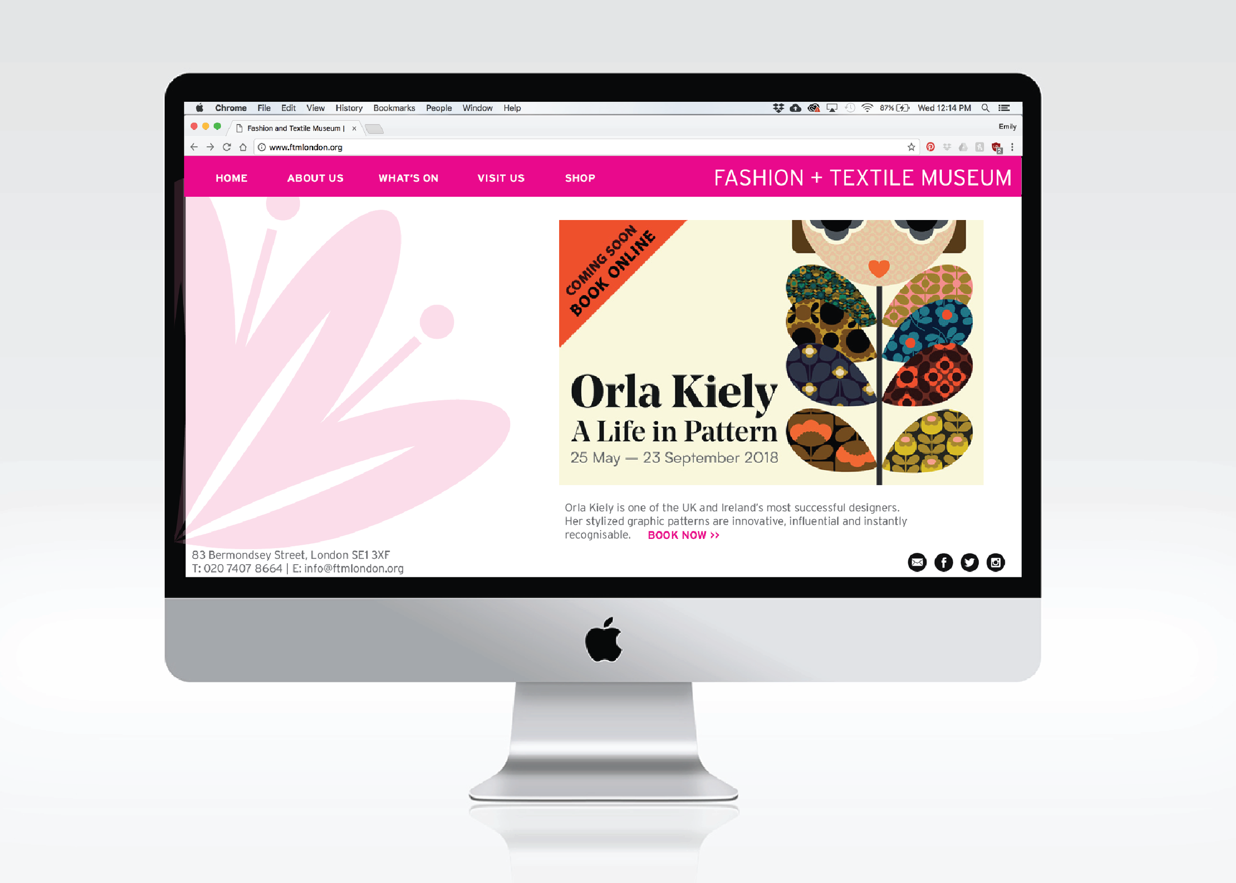
The FTM in London needed a bold, modern and easy to navigate website which highlighted new exhibits, educated the community on past exhibits and got people excited about upcoming events. My hand created logo, which I finished creating in Adobe Illustrator, can be seen here on the homepage in order to further enhance the branding experience for this chic museum. The typography selected was purposefully chosen because of its use in the logo and it is easy to read, making the user experience more streamlined.

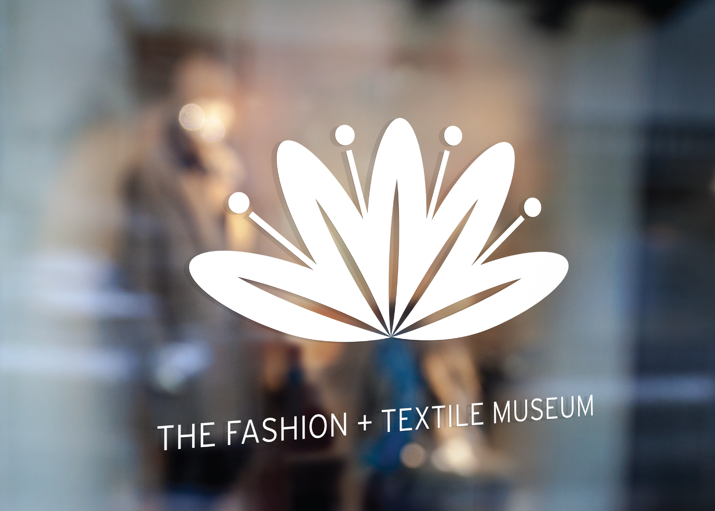
When redesigning the branding for the FTM, of course, I had to think of way finding and signage. Since the museum was all about color, whimsy and creativity, I pushed myself outside of my comfort zone to really make a splash! Using many Adobe Programs, such as Photoshop, Illustrator and InDesign I mocked up some impactful way finding which really highlighted the logo I created, then I constructed a sixty brand guidelines book with the research, the brainstorming, the sketches, the moodboards, the final logo and branind, the way finding, the UI/UX and more!

This logo reflects in many ways the playful and bold nature of this museum. The outward starburst emerging from the slightly floral motif symbolize the Fashion and Textile Museums' commitment to education and fostering community in the London metropolis. This logo was first drawn by hand with many, many other versions. Next, I refined the logo, brought it into Adobe Illustrator and digitized it. Finally, I used Adobe Photoshop to create this mockup so that viewers of the brand book could really visualize how it would look in real life.

This would be an example of the Fashion and Textile Museum's advertising, where you can see that they are promoting an exciting upcoming exhibit by fashion design Orla Kiely. You can see in the upper left corner the branding of the museum-- the signature pink and white, plus the iconic new logo. However, I wanted to be careful with such a bold logo and color way that my typography did not feel too overwhelming. It was my careful design decision to choose a simple, clean typeface for situations just like this, so that my redesign felt organic and didn't compete with the museums' exhibits or advertising.


